Data visualization is taking the world by storm, especially since the outbreak of COVID-19. Looking at data in a visually pleasing manner makes understanding the data easier than gathering it.
But what is data visualization again? It’s taking the data that has been gathered through research and implementing it into mediums such as interactive charts and graphs, images and videos, so it’s easier to interpret. A long spreadsheet of numbers is, arguably, harder to understand than a beautiful graph that highlights the data points.
Back to trends. With data visualization growing in popularity, many businesses are trying to master it as soon as possible, but where do they even start? Here are a few trends to keep an eye on throughout the rest of this year that will help you in your data visualization mastery journey.
 Real Time Data Visualization
Since the outbreak of COVID-19 in March 2020 in the US, we are no strangers to talking about data fluctuations, but do we really know what we’re talking about and can we picture it in our heads? You don’t have to!
Organizations, such as USAFacts.org, created real-time dashboards for COVID case frequency by state and county that are updated almost daily. This is to help people better understand the rate at which the virus spread throughout the country. In the last year and a half alone, we’ve seen this trend skyrocket to popularity.
Data Storytelling
Data storytelling is one of the most important parts of the data analysis process. You can use data visualization to show what has happened over a certain period of time, but if you don’t convey why it happened, then the visualization was for nothing.
Giving the data your presenting a “human” tone makes it more relatable to the audience that data is targeting. The best example of this is Spotify’s Wrapped. Instead of saying “you listened to Spotify for X amount of minutes,” Spotify tells you your year-long Spotify story through data presented as visuals.
This trend doesn’t seem to be going anywhere anytime soon, so future data analysts must hone their storytelling skills.
Video Infographics
This trend took two popular mediums and combined them. Videos are becoming more and more popular in conveying data, so video infographics are one of the best ways to visualize your data.
Bringing back the Spotify example, the Spotify Wrapped series is presented as a short video showing you your stats for the year. Not only are our brains more likely to retain the information
presented to us in video form, we’re more likely to talk about it and compare results.
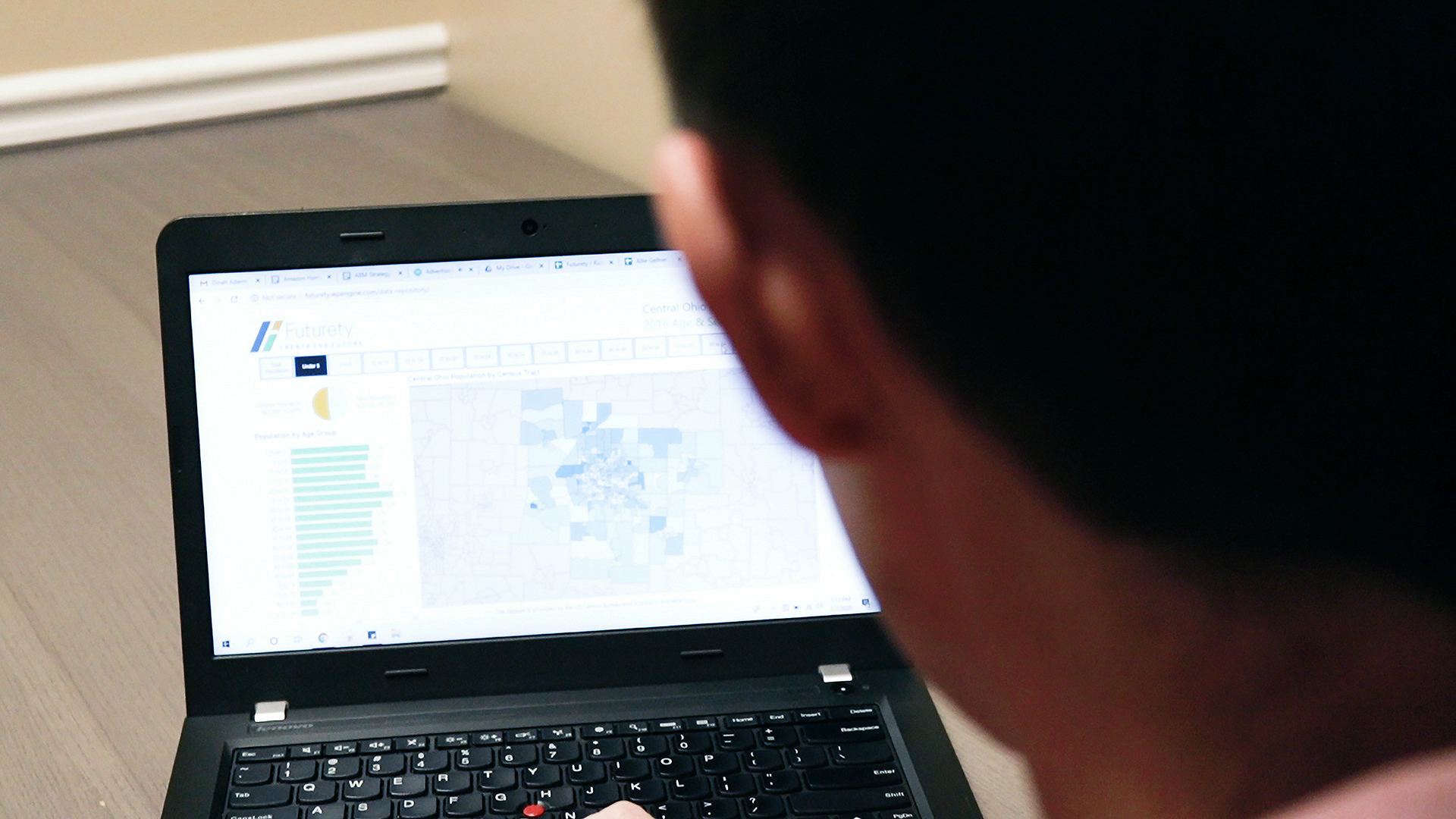
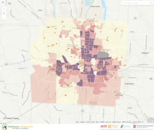
Data Democratization
This trend gained traction during the recent, global pandemic. With so many unknowns, people wanted as many facts as they could obtain. Data democratization helped to bring these facts to everyone. It’s sole purpose is to ensure that data is public to everyone all the time.
A Columbus, Ohio-based example of this is HCGC and Futurety’s project to present data on equitable COVID-19 vaccine distribution. The interactive map shows all vaccination centers around the Central Ohio area in an effort to inform the public about the easiest way to obtain the COVID-19 vaccine.